The use of photographic images in artwork creates a few important considerations that should always be checked. GSM investigates;
Correct Colour Mode
Photographic images should always be set to the correct Colour Mode—CMYK. RGB images used in CMYK-based printing can potentially create problems (including unexpected colour results). The best professional practice is to open any RGB images in an editing app (such as Adobe Photoshop) and change the Colour Mode—go to: Image > Mode > CMYK Colour.
Image Resolution
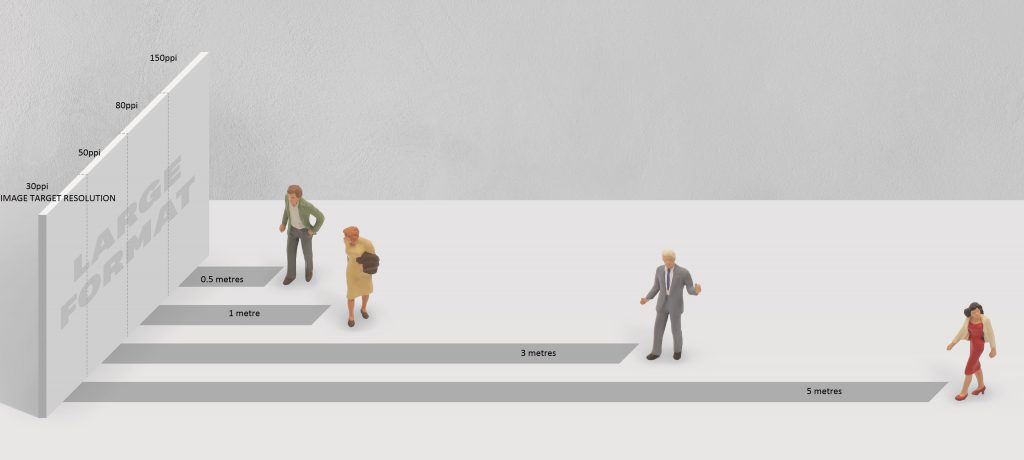
Image resolution, as measured in Pixels Per Inch (PPI), is critical to ensuring photos print correctly. If the resolution is too low, you run the risk of poor image quality. The correct resolution of photographic images for print artwork is primarily based on the print method—as follows:
| Print Process: | Minimum Target Resolution: |
| Offset Lithography / Flexography / Rotogravure: |
|
| Low-end Laser Printing: |
|
| High-end Laser Printing (comparable to Offset): |
|
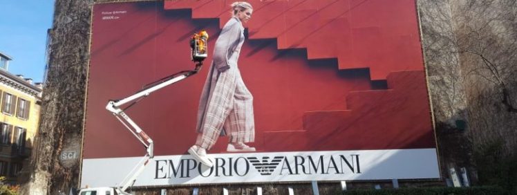
Inkjet Printing (Large Format):
|
|
| Risography: | Ask printer |
| Letterpress: | Ask printer |
Note: these resolutions are the recommended minimum resolutions at the physical size the image appears within the design work (depending on how the artwork is constructed, this may differ from the resolution within the image when opened in Photoshop).
Pixelation
Images with a resolution below these target figures run the risk of softness or pixelation. Pixelation occurs where there is insufficient data within the file to create a smoothly rendered image, instead the pixels begin to form within the printed output (not good!). It is important to note that in this situation, images can often appear fine on screen, with the pixelation only showing on hardcopy proofs, or worse—on the final printed output. Don’t trust what you see on screen—go by the numbers.
You can check the resolution of images placed into both Adobe Illustrator or InDesign using the Links palette. Any images with a resolution under the above minimum targets should ideally be replaced with a higher resolution version. Where higher resolution versions do not exist, you should swap or use a different, larger image —there is no other satisfactory workaround for this issue—do not use Photoshop to ‘scale-up’ the file—this process is called Interpolation and should be avoided as this will result in poor image quality.
Note also that linked Vector graphics (such as Illustrator files placed into InDesign) are resolution independent (providing they do not contain any photographic material)—Pixel Resolution is irrelevant.
Links Palette
The Links Palette in both Adobe Illustrator and InDesign is a great tool to check correct file resolution and Colour Space (CMYK).
- In Adobe Illustrator or InDesign—go to: Window > Links
- Select each image and click the small arrow in bottom left of the Links palette—this will display a bunch of information about the file.
To check Resolution;
- In Illustrator: you are looking at PPI.
- In InDesign: Look at the Effective PPI (ignore the actual PPI)
Both apps use the same Colour Space description (as highlight below in yellow); this should ideally be CMYK.
Pixels vs Dots
 PPI & DPI
A common source of confusion is the difference between Pixels Per Inch (PPI) and Dots Per Inch (DPI)—these are, in-fact, two different things. Let’s take a look:
Pixels Per Inch (PPI):
Pixels Per Inch (PPI) is the measurement of the resolution density of a raster-based image, based on how many Pixels are contained across one linear inch (2.54cm) at the physical output size. This is important in print because print mediums require enough data within the image that— at the physical output size—the Pixels are small enough that they do not form within the printed output. Basically, the higher the resolution density—the greater the amount of data being used to generate the image at the size it is being printed. This is different to Dots Per Inch (DPI)…
Dots Per Inch (DPI):
Digital images must be reinterpreted from Pixels to dots in order to be printed. Dots Per Inch measures the capacity of the output technology to do this—based on how many dots it can output across one linear inch (2.54cm). The higher the number the DPI—the smaller the dots. Small dots result in better quality detail within the printed image—providing there is enough data (PPI).
A low-resolution mono-laser printer might transfer toner onto paper somewhere in the vicinity of 300–600dpi. These dots are large enough that they can clearly be seen on the printed piece using a magnifying glass. In this example; you only need a mid-resolution image (150ppi)—because the output device simply can not reproduce anything higher. By comparison, a platemaker used in Offset Printing might be able to output 2400dpi, or greater, onto a printing plate. These micro-dots are used to form the dots that comprise the halftone screens that will create the printed images.
As a designer working with Offset Printing, you generally do not need to consider the output resolution (DPI), as this does not directly impact the image resolution density (PPI). This might be more relevant when working with some digital print systems, because a low-output device does not need a high resolution image as it simply can’t make use of the extra data. But this does bring us to Lines Per Inch (LPI)…
Lines Per Inch (LPI):
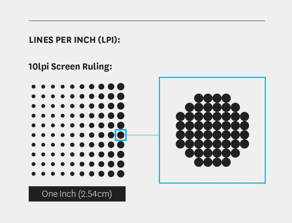 Only applicable to ink-based printing, such as Offset Lithography, where images are printed using halftone screens. Lines Per Inch (LPI) measures the number of lines of dots within the halftone screen across a linear inch. This is called a Screen Ruling. A low screen ruling (such as 65lpi); means the lines in the halftone screen are spaced wider apart. A high screen ruling (such as 150lpi) comprises many more lines of dots, and the dots are closer together. It is important to note that each of the dots within a halftone screen comprises many smaller dots—these smaller dots are the output resolution dots as measured in DPI. It is the clustering of these output resolution dots that creates the variation in dot size within a halftone screen.
Lines Per Inch (LPI) is important in ink-based printing because of paper. The surface quality and absorbency of the stock will ultimately determine how much ink can be transferred onto the paper. If too much ink is transferred, the halftone screens will simply fill and the detail is lost. The purpose of screen rulings is to ensure transferring the optimal amount of ink onto the paper. Most high quality paper used in Offset Lithography can hold somewhere in the vicinity of 150—175lpi. By comparison, low quality paper (such as newsprint) may hold only 85lpi. LPI is not something most designers ever think about—but the reason we are mentioning this is the relationship between—LPI and PPI. In offset lithography, it is the ability of paper to hold halftone screens of ink that determines the target digital resolution (expressed in PPI).
The magic formula is:
- Lines Per Inch x 2 = the required PPI image resolution
As most high quality paper can hold 150—175LPI; this is where the magic number of 300ppi originates from:
- 150lpi x 2 = 300ppi
Similarly, this means low grade stock—such as newsprint (85lpi) only requires images to have a resolution of 170ppi (2x 85 = 170). This is why printing an image with a resolution higher than the target digital resolution does not result in a better image—the screen ruling is too coarse to reproduce the extra data.
PPI / DPI / LPI Summary:
- Pixels Per Inch (PPI): measures resolution density within digital images. The required PPI is determined primarily by the intended print method. And in the case of Offset Lithography, the PPI is determined by Lines Per Inch (LPI) screen ruling based on the paper stock.
- Dots Per Inch (DPI): measures output resolution as determined by the output device—a platemaker (offset lithography, flexography), an imagesetting engraver (rotogravure), or a digital printer.
- Lines Per Inch (LPI): measures the halftone screen ruling used in offset lithography, flexography and rotogravure as determined by the print substrate and it’s ability to hold ink.
Correct Image File Formats
Photographic images used within artwork for print should ideally be saved in a loss-less file format. In most instances this will be either .PSD (the native Photoshop file format) or .TIF (Tag Image File Format). The use of web-image formats is not recommended for print artwork. This includes .PNG and .JPEG— both of which are compression-based, lossy formats—meaning, these save as smaller files, but at the expense of quality, by permanently removing image data (hence the term; ‘lossy’). If you are supplied .PNG or .JPEG images for a print project—it is a good idea to open and re-save these as .PSD files before you place these into your artwork or perform any retouching (it’s a good idea to check and change the Colour Mode and Resolution at the same time).
Compensating For Dot Gain
Dot Gain is a normal part of ink-based printing (this does not affect laser-based digital printing), and is basically the effect of wet ink absorbing and spreading into the paper. The main contributing factor to Dot Gain is the absorbency of the paper (density of ink also plays a role). Paper with higher absorbency (such as Uncoated Stocks) are more affected, papers with lower absorbency (such as Coated Stocks) are less affected.
Dot Gain can cause photographic images to go slightly darker—especially in the mid-tones and shadows. You can compensate for Dot Gain, particularly if you are printing on an uncoated paper, by processing your images in Adobe Photoshop, and using the Curves function; lower the Output mid-point within each image (from 50 to about 40 should be sufficient). The mid-tones in the images will appear slightly lighter on screen—but will darken on press to print closer to the original. If you suspect Dot Gain may be an issue in your images—talk to your printer.
Packaging and Exporting Artwork Files
A recommended last step in the artworking process, is to package the project. Packaging is a useful tool in both Adobe Illustrator and InDesign (go to: File > Package), the purpose of which is to gather all the linked files into one selfcontained project folder—which is great for archiving. But also, as part of this process, this will run a Report which can be a useful backstop. Take the time to skim over the generated report, looking to see if this has highlighted any potential issues such as incorrect colour mode and resolution. When the artwork is good to go, most printers will want a single PDF file. Generate this as follows:
- In Adobe InDesign: Produce the PDF using the Export function, use the Adobe PDF (Print) option—not Adobe PDF (Interactive).
- In Adobe Illustrator: Produce the PDF using the Save As (change the format to Adobe PDF).
In both Apps;
- Change the Adobe PDF Present to Press Quality.
- In the Marks and Bleeds settings (down the side of the dialogue box) make sure to turn on the Crop Marks and tick the Use Document Bleed Settings.
That is it—artwork complete. Job should be good to go.