
Colour is one of the areas that causes the most problems in print. Here are some things to be mindful of:
Using The Correct Colour Model
Regardless of the intended print process—artwork for print should always use the CMYK colour space—not RGB. This means:
- Artwork source files (e.g. Adobe Illustrator or InDesign) should be set up using the CMYK (Print) Colour Mode.
- All linked photographic images should also be converted from RGB to CMYK mode, resaved and relinked into your artwork.
- When you are adding colours into your artwork, make sure these are CMYK based colours. The only exception to this is when using Spot Colour or print specials (see below). Do not use RGB colours in artwork for print.
- Be aware that copying and pasting or placing graphics from an RGB source file into a CMYK-based file will often cause colour problems. This is due to the way the RGB colour is reinterpreted into a CMYK breakdown. And likewise, switching the Colour Mode on an artwork file from RGB to CMYK will do the same thing to any pre-existing colours within the artwork.
Blacks
In artwork for print, Key-Black should be used for any ‘black’ fills and strokes— including all black text. Ensure the colour breakdown of the Black you are using in your document is set to: C=0 M=0 Y=0 K=100. Be careful about using Rich Blacks (see below)—and do not use the swatch named ‘Registration’ as Black.
Rich Blacks
 A ‘Rich Black’ is a black comprised of colours other than just Key-Black— we’ve included an example in our swatches palette (above): C=75 M=65 Y=63 K=81. The use of Rich Blacks should be avoided as these can cause printing issues. It can, however, be difficult to visually identify the use of Rich Blacks within artwork files. One thing that can help is to change the Preference/Setting (InDesign/Illustrator) called Appearance of Black. This setting controls how Black appears on screen and how this will output for print. For print work— change these settings to:
- Display All Blacks Accurately; and
- Output All Blacks Accurately
Changing these settings will mean Rich Black appears much darker on screen than straight Key-Black. This will help you identify where, and if, Rich Black is being used in your artwork. Change any Rich Blacks over to Key-Black.
Shiner Blacks
There is an exception to the above rule about Rich Blacks—which is adding a shiner to black. Shiner Blacks are Blacks comprised of Key-Black with another Process colour added (normally a tint of Cyan or Magenta). This creates a denser black, whilst avoiding the issues associated with Rich Blacks. Note also, that the added tint will colour-cast the black—for example: adding a 50% Cyan to KeyBlack (C=50 M=0 Y=0 K=100) will create a cool black, adding Magenta to Black (C=0 M=50 Y=0 K=100) will create a warm black.
If you are planning to use a Shiner Black—make the printer aware of this so they can expect this output (otherwise they may inadvertently change this, thinking it is a mistake in the artwork).
Whites
In CMYK-based printing, White is most commonly achieved through the absence of printed colour—i.e. where there is no colour, you see the paper stock—which is usually ‘white’ (this is why the White swatch in InDesign is named ‘Paper’). This means that white is generally not a printed colour. However, different paper grades vary considerably in terms of whiteness from cool blue whites to warm whites and soft ivory or creams—and this will affect printed colour and the overall look. These are, however, some methods for printing white:
- In Lithographic Offset printing: White can be achieved using Foiling
- In Flexographic or Rotagravure printing: White is often printed as an opaque underlay to provide a base for CMYK to sit over – if you look at printed clear plastic bags, you’ll often see white prited under the CMYK colours
- Some digital laser-based print systems can print white using special toners.
Black & White Foils
Sometimes you might see design work where Black or White has been printed in a really dense and opaque manner. This is likely to be a non-metallic Foil which, unlike translucent ink, is fully opaque. This can be done using a number of different methods. To set up a Black or White Foil within your artwork—see below…
Setting Up Spot Colours & Specials
From an artwork perspective, most Specials are set up within the artwork file in the same manner—this includes:
- Foiling
- Die-cutting
- Embossing/Debossing
- Pantone Spot Colour or Digital Specials
Creating A Colour Separation
Regardless of the type of Special; the aim is to set up a Spot Colour within the artwork file. Using a Spot Colour tags the Special as being different to all other colours within the file—creating a colour separation which is not Cyan, Magenta, Yellow or Key-Black.
Looking at our Swatches palette (below) from our artwork example—you can see the Spot Colour: Pantone PMS021 U. When this artwork is processed, this will result in a Cyan, Magenta, Yellow and Key-Black separation— plus a separation for the Spot Colour. In our example, which was printed using Offset Lithography, this separation will be used to create a printing plate for the Pantone ink. But if the intended Special was Die-cutting, Embossing/Debossing or Foiling— this separation would be used to make the required block/s or knife.
Creating a Spot Colour within Adobe InDesign or Illustrator is fairly simple—follow these steps:
- Open the Swatches palette and create a new Swatch.
- Double click the new swatch to activate the Swatch Options dialogue box.
- In the Swatch Options; Change the Colour Type from Process > to > Spot. Leave the Colour Mode as CMYK, or if this is RGB—change this to CMYK.
- You need to name the Spot colour:
- If this is a printed colour (Pantone Ink or Digital Special), name this with the correct colour code.
- If this is a non-Printed Special (Die-cutting, Embossing/Debossing, or Foiling), this can be named anything providing the printer can identify this.
- OK this and start using your new Spot colour in your artwork.
Note that Colour Breakdowns for Specials do not influence the printed output
Mastering the Colour Swatches Palette
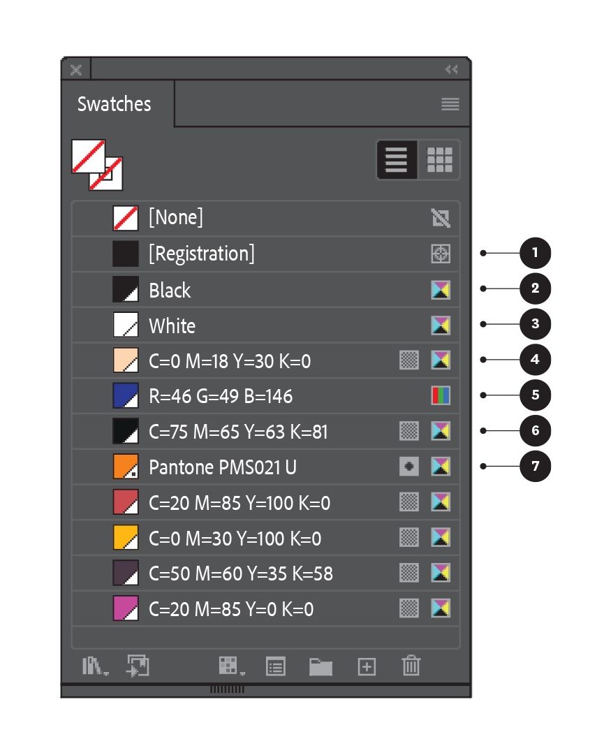 Above is the Swatches palette from Adobe Illustrator from our example project (below)—note that the Swatches palette in InDesign works in a similar way. Here are some things to note:
- Both Adobe InDesign and Illustrator include a default colour named ‘Registration’ within the Swatches palette—even though this appears as black this is not a colour— do not use this as Black within artwork.
- In CMYK-Colour mode files; use this Black, make sure the colour breakdown is: C=0 M=0 Y=0 K=100.
- This is the correct White to use, the colour breakdown should be C=0 M=0 Y=0 K=0. In InDesign the equivalent swatch is named ‘Paper’.
- This swatch is a CMYK colour as identified by the CMYK icon on the right of the swatch. The chequerboard icon next to the CMYK icon indicates that this colour is Global—this means that if the colour breakdown is changed, the change will automatically update in all instances of this colour throughout the artwork (as opposed to a non-Global colour which will not update throughout the artwork). Note that InDesign only uses Global colours.
- This swatch is an RGB colour as identified by the RGB icon on the right of the swatch. This colour should be checked and changed to CMYK—the RGB colour breakdown may not print as expected.
- This swatch is a ‘Rich Black’ comprising all four process colours—not just Key-Black. Using this colour in inkbased printing may cause registration and drying issues. In laser-based digital printing this may cause fusing issues. To clean this up, anywhere this has been used within the artwork (including all black text) should be changed to Black.
- This swatch is a Spot Colour (this example is a Pantone PMS Orange) as identified by the small dot in the colour sample box and the Spot colour icon on the right hand side of the Swatch. Note that Spot colours are always Global.
Pantone versus CMYK
 The example above illustrates the difference between a Pantone colour; and its nearest CMYK equivalent—as you can see, the difference is pronounced.
Pantone PMS Colours are a type of Spot colour. However, there are other forms of Spot colour. Basically, any printed ink or toner that is non-CMYK within the artwork, is fundamentally a Spot Colour. This includes Digital Specials such as a tonerbased Gold, and clear print coatings such as Varnishes or UV coatings (when these are printed in ‘Spot’ areas)— these are Spot colours, but NOT Pantone Spot Colours.
Adding Pantone colours into artwork is the same process described in Creating a Colour Separation—but make sure to use the correct Pantone Code as the Swatch name. You can set the Colour Breakdown for the Pantone Swatch by using the CMYK equivalent breakdown—but you will either need a Pantone Bridge Swatchbook or a subscription to Pantone Connect (connect.pantone.com) to get this information. Ultimately, however, the colour breakdown used for a Pantone PMS Swatch is for on screen purposes only and has no bearing on the output printed colour whatsoever. Our example Pantone PMS021 U—will print as an Orange ink no matter what colour is displayed on screen
Knock-Outs, Overprinting & Trapping
 When working in Adobe Illustrator or InDesign, where any element (including text) overlaps another element, the overlap relationship between the two elements needs to be resolved in order for printing to achieve the intended output. By default, this relationship is resolved automatically with the topmost object taking precedence over anything underneath. During print processing, information below the topmost element is ignored. This is called knockingout—and in most instances, this will be the desired outcome.
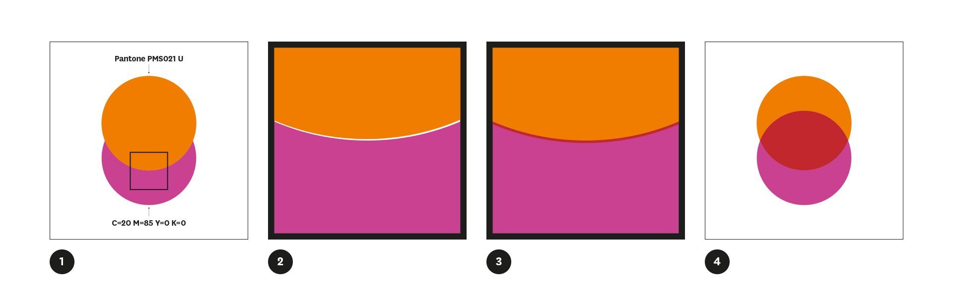
Diagram 1
We can see this in Diagram 1: The orange circle, which is the top object in the artwork, takes precedence over the pink circle. —Even though the pink circle is a complete circle shape within the artwork, the part that runs underneath the orange circle knocks-out and does not print.
In ink-based methods of printing (not applicable to digital printing), Knockingout can create one potential problem. —Where the two objects meet and the knock-out occurs, there is the potential that any slight misregistration during the printing process will result in an unsightly hairline where the two elements do not fully touch.
Diagram 2
Diagram 2 shows a 500% close up of our two circles where this misregistration has occurred. —Even though this doesn’t look like much, it can be quite noticeable. Where this has the potential to occur; Trapping should be added to the artwork to avoid this problem.
Trapping is a fine stroke (0.5pt is usually sufficient) added to the top object and set to overprint. This slight increase in the width of the top object, combined with the overprint, compensates for any potential misregistration.
Diagram 3
Diagram 3 shows the same close up of our two circles with trapping applied. Within both Adobe Illustrator and InDesign, trapping can be set manually by applying a stroke to the element (using the same colour as the fill) and setting this to overprint—go to:
- Attributes palette > Overprint Stoke.
If in doubt about knock-outs and trapping, ask your printer to check the artwork (but don’t assume they will do this unless you have asked them to do so).
Overprinting is effectively the opposite to knocking-out. When overprinting is employed, both elements will print—the top element will simply print over the element beneath. This is not usually the desired outcome, but can be employed —particularly when working with Spot colours—to create more colour mixes.
Diagram 4
Diagram 4 shows the same two circles as diagram 1, but the top object has been set to overprint—the result is two full circles; where they overlap a new colour (a red) is created. Within both Adobe Illustrator and InDesign, overprinting can be set manually—go to: Attributes palette > Overprint Fill.
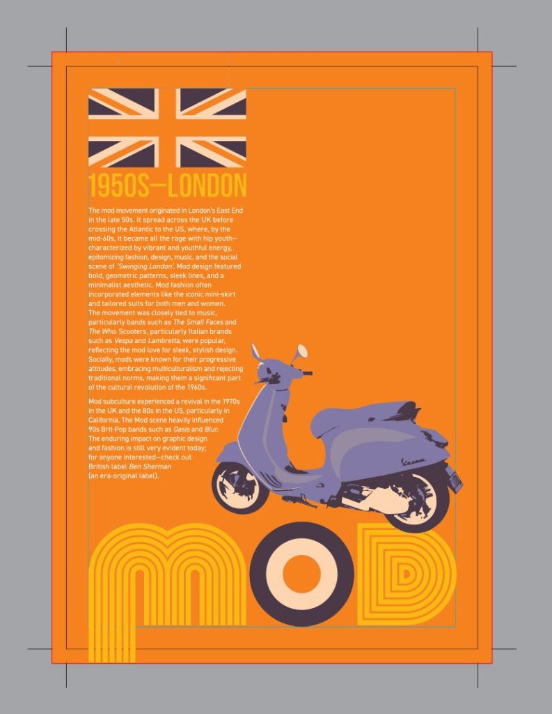
Artwork Example
Looking at our artwork example; this five-colour job was printed using CMYK + Pantone PMS021 U. It employs knocking-out and trapping (in the yellow text), and overprinting (the red in the bullseye and the Union Jack).
It is important to note that there are situations where overprinting should be used. When drawing shapes for Die-cutting, Embossing/Debossing and Foiling— these elements are non printing and should be set to overprint so they do not knock-out from the underlying artwork.