
If you have worked as a graphic designer in the UK, you’ll rcognise the name – GF Smith, make of high-quality specialist paper stocks. As we’re also paper people, when GF Smith undertook a rebrand earlier this year, the results naturally caught our eye.
GF Smith – rebranding a legacy
The challenge in rebranding any long-established business, such as GF Smith, one of the world’s oldest paper specialists, is the responsibility that comes with all that legacy.
Add to this—the weight of knowing that, in the case of this particular client, your work is going to be seen and judged by most of your creative industry peers. Surely, a task that would solicit equal parts trepidation and excitement in anyone taking it on.
Additionally, with the last revision of the brand occurring more than a decade ago, a lot has changed in the business, the creative industry, and the broader world in the time since. GF Smith’s Global Brand Director, Ben Watkinson, explains,
‘Our previous visual identity was pivotal in shaping the GF Smith brand that resonates worldwide. But as the world evolves—becoming more digital, immediate and connected—so must we. This rebrand isn’t about leaving our roots behind; it’s about adapting to meet changing expectations while staying true to who we are.’
A holistic modernisation
Modernisation was, therefore, at the forefront of the project. The key was finding the right creative partner to realise this objective. When the team at GF Smith first met the team at TEMPLO, a cause-led branding and communications agency based in Shoreditch, London, they knew the fit was right.
‘TEMPLO understands that branding isn’t just skin deep—it’s holistic,’ says Ben. ‘Not just what you look like, but what you do, how you think, and how you make people feel.’
Over the years, TEMPLO has worked on a vast range of culture and community projects. This includes an identity for the corporate watchdog Raid, an optimistic new look for the Free Syria’s Disappeared campaign, and three different identities for the British Pavilion at the Venice Biennale.
This catalogue of community projects was congruent with the team at GF Smith, which runs initiatives such as the GF Smith Charitable Trust. The trust provides educational and industry opportunities in the creative field for young people disadvantaged by circumstance. In fact, 2% of the company’s profits go to supporting the Trust. It was also this community spirit that attracted TEMPLO to the project. As Pali Palavathanan, co-founder and creative director at TEMPLO, explains, ‘Bringing our experience across human rights, climate change and education, we ensured the [new GF Smith brand and Trust] were built from the foundations of authenticity, transparency and a genuine commitment to making a difference’.
GF Smith – a gently radical spirit
 The team at TEMPLO began the project by exploring the GF Smith story through a series of conversations, audits, workshops and engagement sessions. These included as many people as possible, both within and outside the business. By listening to their stories, the team at TEMPLO discovered an underlying ‘gently radical spirit’.
As Anoushka Rodda, TEMPLO’s co-founder and managing director, explains,
‘GF Smith ‘is full of warmth, character and social conscience’.
These values needed to be at the forefront of the new brand. It also helped that the client was ready and willing to move towards something new.
A truthful & honest reflection
 And the results, the developed brand is built on a maximalist approach. Utilising colour and motion to create a dynamic personality that resonates with a global audience of creative minds. As Ben at GF Smith explains, ‘We think the brand is the most accurate, truthful and honest reflection of our people, values and mission.
‘To connect with and inspire the creative community and the next generation of designers, to help people create using one of the world’s oldest and most natural and sustainable materials. And to do all that by being who we are. An organisation that has community and society at its core.’
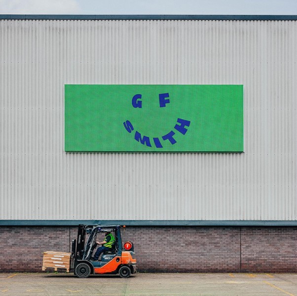
A gently radical, slightly subversive rebrand which adds a new chapter to the legacy of this iconic brand.
REBRANDING PROCESS
Working closely with GF Smith, the team at TEMPLO led the rebranding process. Establishing a ‘Next Chapter’ steering group which engaged with as many people as possible in and around the company. This approach, delving into the heart of the business, resulted in the brand positioning statement: ‘Feel Good Papers’.
From this, the design team created a versatile, multi-platform branding system. This included a new omni-directional logo that interacts across all levels of the brand architecture. And supported by a vibrant, high-contrast colour palette drawn directly from the GF Smith paper collection. The rebrand is future-facing, playful and radically different within the world of paper. The rebrand embodies GF Smith’s values, their role within the contemporary creative landscape, and commitment to creativity.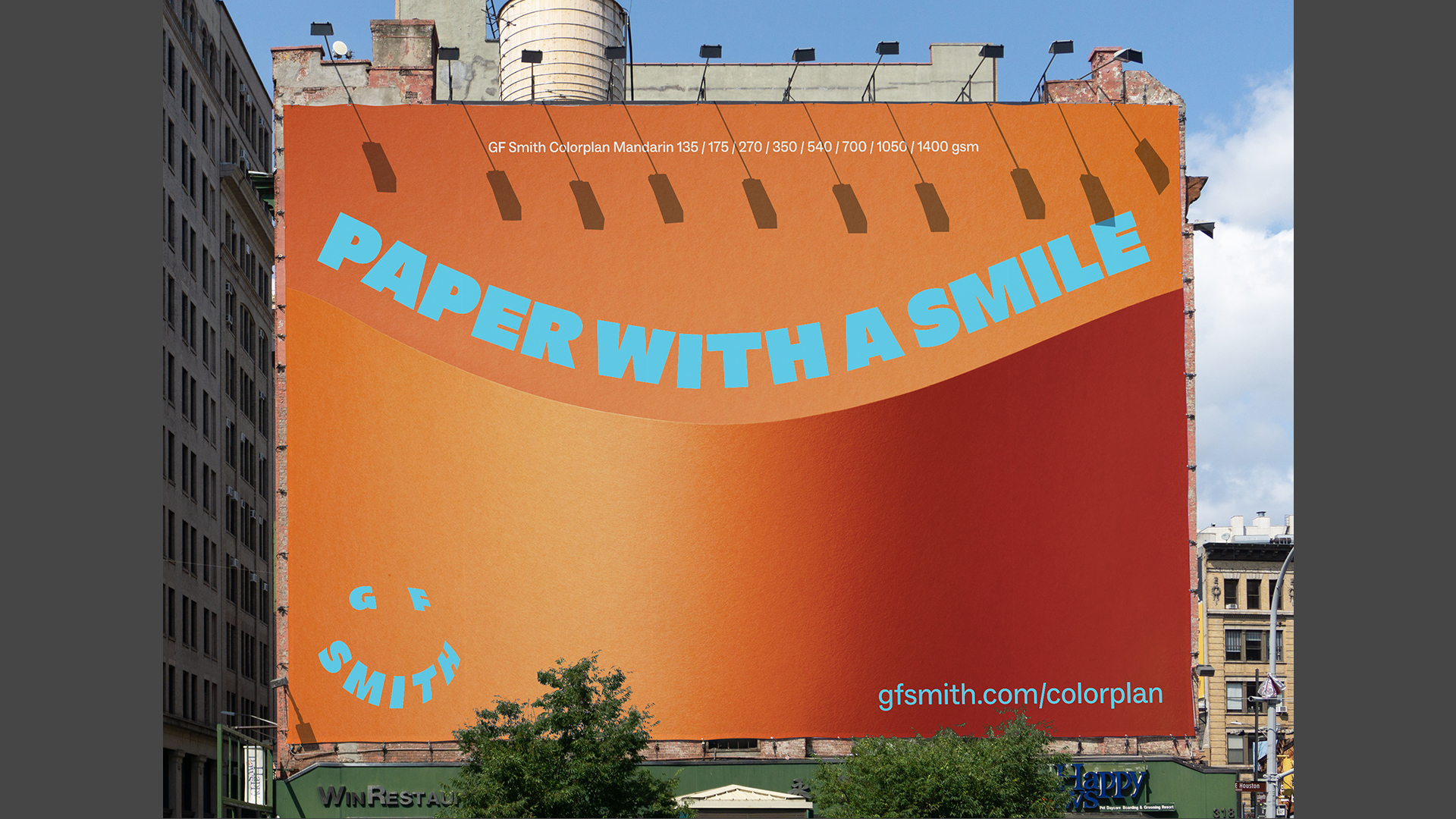
Tools of the trade for GF Smith
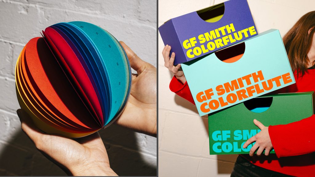
To assist designers in selecting stock from the GF Smith Colorplan range, TEMPLO created two industry tools:
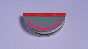
 The Smile Book: The lay-flat swatch book is a dynamic way to show the GF Smith Colorplan range. The shape reinforces the brand messaging, and the book cleverly opens into a rainbow globe of colour.
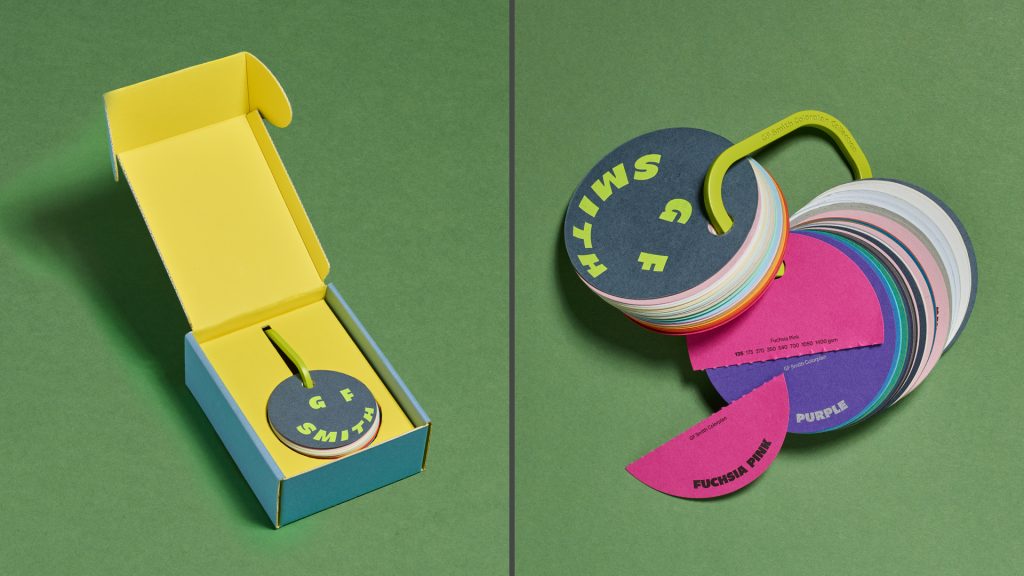 The Carabiner: Allows designers to sample all available colours in a format that can be updated as the range changes. Each swatch includes a handy perforated tear-off, allowing stocks to be compared, and providing clients with a takeaway sample.
We would like to thank GF Smith & the team at TEMPLO for sharing their story on this wonderful project.
GF Smith Colorplan stock is available in Australia via Ball and Doggett—go to: //ballanddoggett.com.au
For NZ readers, the equivalent coloured stock from BJ Ball is Trophee—go to: //bjball.co.nz