
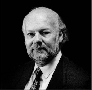
 Dubbed ‘Mr Logo’, Australian Ian Kidd (1941—2022) was one of an early batch of home-grown designers to venture yonder. He returned brimming with ideas and seeing the potential for our industry downunder.
Ian Kidd began his professional career in the late 50s. He started with a stint within the in-house advertising team at the Adelaide branch of department store giant, Myer. And, proving that designers not proofreading their work is not a new phenomenon—his first advertisement for the Myer Food Hall included the headline, ‘2 pounds of mice’ instead of ‘mince’. Ian soon attracted the interest of the Clem Taylor Agency, where he worked as a Junior Account Executive. This role diversification provided opportunities to acquire new skills and develop a more pragmatic approach to the business of design. Work that had to result in sales.
Overseas Experience
In 1961, aged 21, Ian spread his wings in a desire to get amongst one of the world’s great design centres. He headed to London, where he secured a gig working for an education organisation producing brochures. Twelve months later, Ian boarded the transatlantic Ocean Liner, Queen Elizabeth, and sailed to North America. He briefly visited New York City, before heading to Ottawa, Canada. Here, he worked within the advertising sector. He soon moved into an inhouse design role at the Campeau Corporation, the largest privately-owned real estate development and investment firm in the country at the time.
The 1960s were a period of significant social and political change in Canada. A new sense of national identity was emerging. This was reflected in the adoption of a new flag— the Maple Leaf, which replaced the colonial Ensign. Celebrating this new identity, Montreal hosted Expo 67. A world fair showcasing the best of human endeavour and subsequently cited as being one of the most successful events of its kind. Attending this event inspired the young Australian. He returned to it several times to absorb the many ideas on display. Ian described his seven years overseas as the ‘time he came of age’. And from a career perspective, this was evident with him winning three major US design awards.
Returning Home
In 1968, Ian returned to Australia. His exposure to the more sophisticated design culture in the UK, and an emerging one in Canada, had opened his eyes to new possibilities at home.
‘I knew that graphic design was so new here that I’d have to be an idiot not to make a success of it’.
His first berth back in Australia was with advertising firm George Patterson. For whom Ian spent several years playing a key role in the agency’s prodigious growth. The agency became one of Australia’s largest, rebranding in 2017 to Y&R ANZ. Ian was appointed National Creative Director. However, not long into the appointment, he decided to leave the advertising sector to work for himself, focussing solely on design.
The Evolution of Mr Logo
Among his first clients were the City of Monarto, and building firm Martens and Marshall. A client on which he collaborated with high-profile fashion model Maggie Tabberer. Property developers proved a rich source of work, attracted by Ian’s overseas experience with the Campeau Corporation.
Ian briefly joined forces with another iconic South Australian designer, Barrie Tucker (AGDA Hall Of Fame 2014). Together they established Tucker and Kidd. During this period, in 1979, the firm employed Karin Seja—a fourth-year design student from the University of South Australia. When Tucker and Kidd dissolved Ian re-established his practice (Ian Kidd Design—IKD). Karin went with him. She stayed, progressing to company director. In 2007, she bought Ian out rebranding the company to KSD. Karin reflects on this period,
‘…[In the 1970s] graphic design was a new discipline. The value of a visual brand was not realised. This all changed in the early 1980s when businesses recognised they really needed a decent logo. With only a few competitors in Adelaide, the business went ahead in leaps and bounds; Ian was known as ‘Mr Logo’. [Ian] had an amazing talent for analysing a person and their business. He quickly established a rapport which led to some loyal long-term clients, some over 40 years’.
Scribblings, a regular promotional newsletter published by IKD, provides insight into working at the studio, ‘During subsequent years, IKD won almost anything worth doing at the big end of town, gradually expanding interstate and, eventually, offshore; always with a group of consummate professionals who knew that working at IKD meant—hard yakka, long hours and the achievement of excellence and fun’.
In recognition of his contribution to our industry, Ian Kidd was inducted into the AGDA Hall of Fame in 2020. Sadly, Ian passed away two years later, in 2022, leaving behind a legacy of design excellence—a true pioneer in our corner of the world.
Celebrating Australia
Ian produced a significant body of work celebrating Australia and its regional institutions and organisations, such as these examples:

 This bright orange and blue National Rail branding created in the mid-90s was seen across Australia through to 2002 when the entity was rebranded as Pacific National. The background illustration is taken from the cover of ‘Across One Nation’, a book commemorating the completion of rail gauge standardisation in Australia.
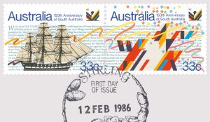 These commemorative stamps produced by Ian in 1986, and issued by Australia Post, celebrate the 150th Anniversary of South Australia.
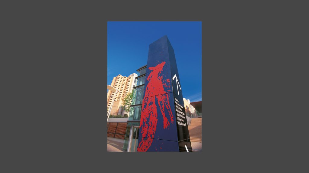
APPLIED BRANDING AND SIGNAGE
A natural extension of branding is signage. This installation, signage for the Riverside Precinct (Adelaide) 2001, demonstrates Ian’s skill of applying two-dimensional graphics within a three dimensional space where lighting, texture and materials are added considerations:
A WORLD OF LOGO
During the 1980s, Ian gained the reputation of being ‘Mr Logo’—a reflection of his many high profile national identity projects. It is a testament to the enduring quality of the work that many of these identities are still in use today. Examples shown:
 >Left: State Bank of South Australia logo, c.1984 (now part of Westpac)
>Right: Arts South Australia logo, c.1990s
AFL PORT POWER
 In 1997, Ian Kidd rebranded Port Adelaide Football Club ahead of the team’s admission into the AFL competition. Historically, Port Adelaide employed a Magpie motif, including a black-and-white colour scheme. However, as the AFL already included a team—the Collingwood ‘Magpies’—an entirely new concept was needed. The name ‘Port Power’ was developed (later shortened to just ‘Power’), and a logo, inspired by the mythological Greek God Thor’s lightning bolts, was designed playing to this theme. Ian introduced Aqua to the brand colour palette to help differentiate the team from Collingwood. The first session team uniform (shown here) used the lightning bolt as a graphic device.
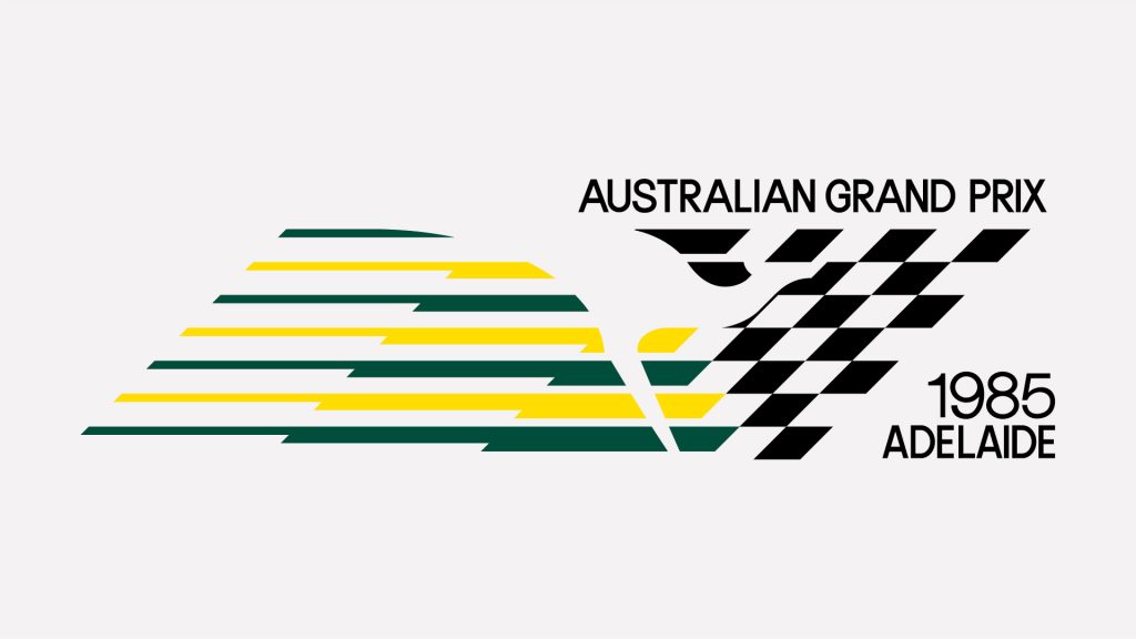
1985 AUSTRALIAN GRAND PRIX
 Attracting a huge global audience, Formula One motorsport is without doubt, one of the most prestigious sporting competitions in the world.
In 1985, Adelaide hosted the inaugural Australian Grand Prix as the final round of the world championship. The event, run as a street race around what is now named the Parklands or Adelaide Street Circuit, presented an enormous opportunity to raise the international profile of both the city and South Australia.
Tasked to help realise this opportunity, they appointed Ian Kidd to undertake the visual identity for the event. The resulting logo type cleverly captured the excitement, speed and feel of motorsport’s premier event combined with a distinct Australian flavour through the use of colour and the kangaroo shown as a silhouette in negative space.
Ian reproduced the logo across a wide range of merchandising including the official programme, flags, enamelled badges and embroidered patches—some of which are highly valuable today by motorsport fans.
WINE
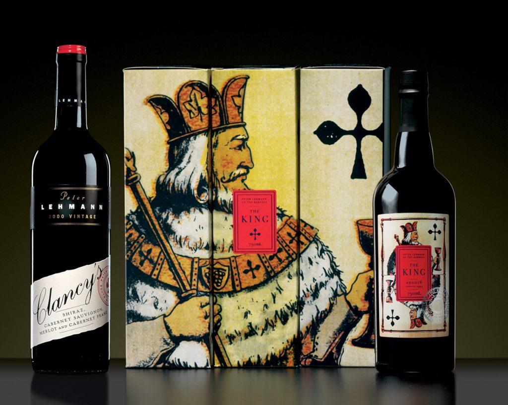 Looking at the popularity and sheer size of the Australian wine industry (in 2024, worth more than $2bn in overseas sales), one could be forgiven for thinking that the sector has always been a significant contributor to the export economy. But, wine only really took off as an export product in the 1980s. Subsequently, this sector became increasingly important for design studios that could produce the goods.
Ian’s studio produced many innovative and landmark designs, such as this Peter Lehmann ‘The King’ Vintage Port label (mid-1990s), which sought to engage new audiences beyond traditional wine drinkers, and the more traditional Clancy’s blended label created for the same winemaker.
GSM would like to thank Dominic Hofstede, Creative Director at Mucho. We would also like to thank Larissa Meikle, Kate McDonald and Simon Pemberton—their book ‘On the Shoulders of Giants—a Tribute to 13 Graphic Designers’ [p. 2016. ISBN: 9780646909196], was a source for this article. We would also like to thank Graham Rendoth and the Australian Graphic Design Association (AGDA) for their assistance in collating this material.
— This article is edited from an original text written by Dominic Hofstede on the occasion of Ian Kidd’s induction into the AGDA Hall of Fame in 2020.