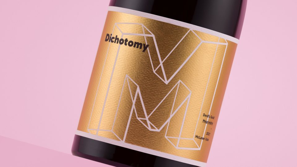
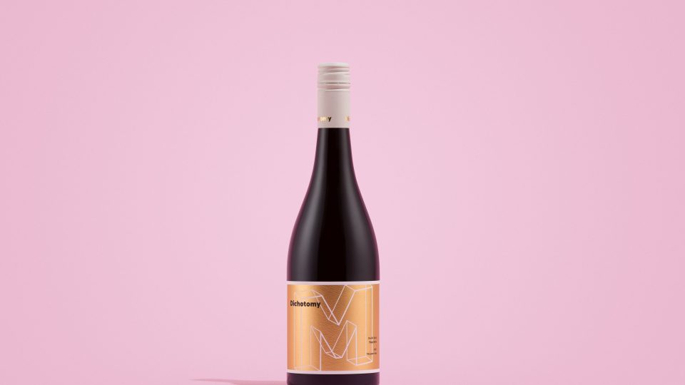
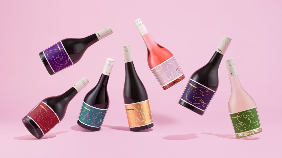
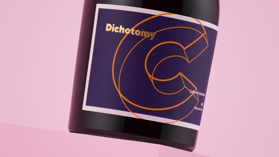
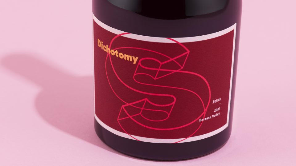
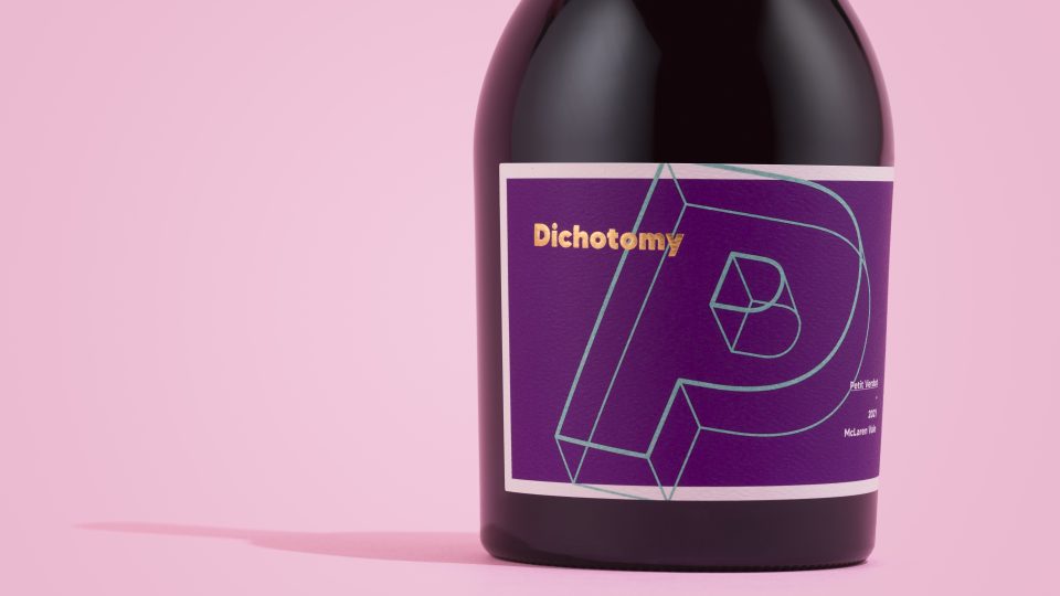
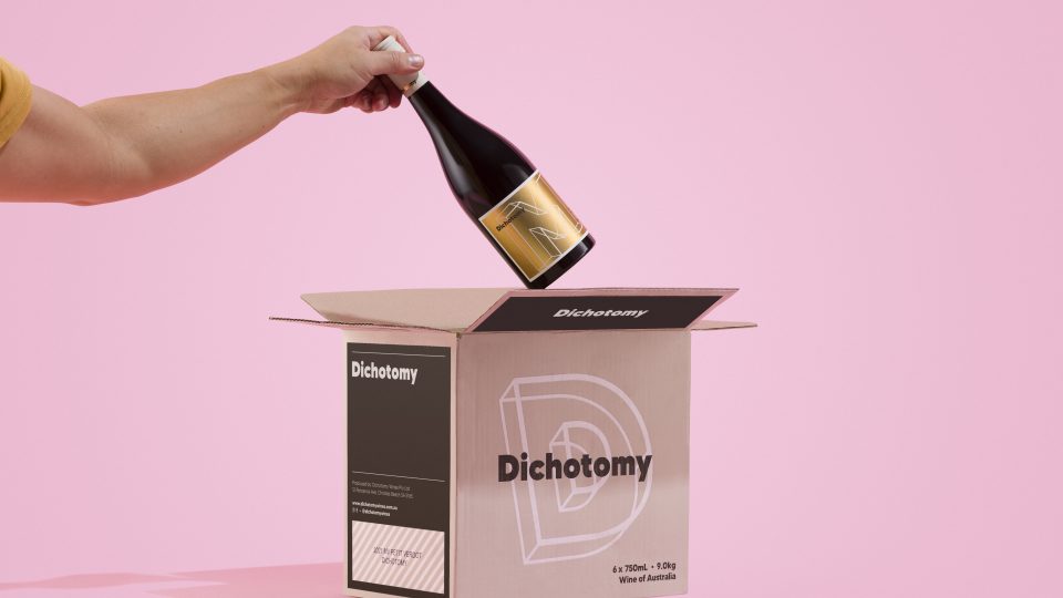
Embracing its name, Dichotomy offers unique and diverse flavours by combining grape varieties sourced from South Australia and Washington State in the USA. Pitched at the premium end of the wine market, the brand challenges traditional varietal perceptions, and promotes regional exploration. The label design reflects these brand aspirations through the use of non-traditional, vibrant colours, playful typographic visuals, and innovative use of foil embellishments.
CREATIVE: Byerlee Design (South Australia)
PRINT: CCL Labels (Barossa, South Australia)
CLIENT: Dichotomy Vineyards
PROJECT: Dichotomyn Labelling
STOCK: + Ball & Doggett Bright White Felt 30% PCW
PRINT SPEC: Printed Offset using Spot Colour + Gloss Gold Foil, Emboss and Matt Varnish Embellishments
PRINT: CCL Labels (Barossa, South Australia)
CLIENT: Dichotomy Vineyards
PROJECT: Dichotomyn Labelling
STOCK: + Ball & Doggett Bright White Felt 30% PCW
PRINT SPEC: Printed Offset using Spot Colour + Gloss Gold Foil, Emboss and Matt Varnish Embellishments