Now and then, a project comes cross our desk that really jumps out. Whenthis exquisite coloured card package turned up at GSM we knew we needed to show it. Here is Sculpt by Studio Ok-Ok.
Sculpt – a cosmetic studio with a difference
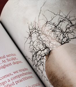
 Based in Adelaide’s inner east, Sculpt is a cosmetic studio with a difference. Welcoming all body types, tones, genders and maturities, and offering an approach grounded in rejuvenation that goes beyond the aesthetic. Treatment services, backed by progressive technologies, encourage physical and mental wellbeing to help restore confidence towards one’s skin. A welcome change in an industry often focussed on appearance alone. Adelaide’s Studio OK-OK undertook the task of branding and creating the initial touchpoints for Sculpt, with an emphasis on reflecting the values and positioning of the clinic as a haven for ‘rejuvenation of the self’. The visual approach is built on refined typographic forms, a warm colour palette and the use of tactile, highquality, crafted materials. This combination creates a sincerity a world away from the stereotypical, sterile and clinical approach often used in the cosmetic and beauty sector.
Creating a welcoming feel
For the marketing collateral, the initial intention was that a small saddle-stitched brochure would serve as a first touchpoint for many clients. However, during discussions to develop content for the brochure, it became clear that presenting a fuller, richer story would resonate better with clients, for whom treatments are often part of a deeply personal journey. As such, this marketing collateral needed to be welcoming and thoughtful, showcasing the complete range of services on offer.
Craft & Control/Aesthetics & Science
Key to approaching the project was the theme of ‘Craft + Control’. ‘Craft’ in exuding a distinct visual elegance and design finesse. And ‘Control’ in the measured selection of paper stocks, foils and finishes. This was to reinforce the relationship between aesthetics and science while echoing Sculpt’s industry-leading services and unmatched attention to detail.
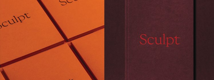
 The team decided to expand the project by incorporating the brochure and other collateral into a single marketing piece. The intention was to create a premium experience. The initial bind format for the brochure was changed from saddle-stitching to burst-binding. Thus, allowing for more pages and a sharper look. This change also meant two different paper stocks could be used in a flexible manner for the internal pages, something that is more problematic using standard saddle-stitching. For the brochure cover, Ball & Doggett Colorplan stock in the Claret colour was selected and foiled on one side. The internal ‘image’ pages are printed in CMYK on Ball & Doggett Sovereign Silk, a coated stock, resulting in a brighter colour. The ‘text’ pages are printed in Pantone 186 on uncoated Sovereign Offset.
Colorplan
The decision to use coloured stocks in combination with foiling was a conscious one by the team at OK-OK. They wanted to express the brand and the accompanying colour palette in a more crafted manner than would be achieved using printed ink on white stock. The team specifically chose Colorplan for its tactile finish and suitability for foiling. The Rust and Claret colours are in keeping with the brand identity. The Cool Grey provides a reserved contrast. The foils are pigment colours, which have a smooth, opaque, matte finish. This is very different from standard metallic foils. The intensity of the pigment colours perfectly complements the Colorplan stock, creating a restrained touch of luxury and reinforcing the brand personality.
Business cards
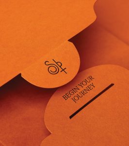
 Accompanying the brochure are business cards, produced in two variations. Using either Ball & Doggett Colorplan Rust or Claret, the cards are duplexed with Colorplan Cool Grey. They are then foiled on both sides, as well as along the edges, creating a gilded look. Also included are compliment slips and gift cards. Both produced using duplexed Colorplan Cool Grey foiled on both sides and edges. An elegant die-cut wallet, made from Colorplan Rust and foiled with the brand name, completes the package.
Technical expertise
To achieve the desired high level of finish within budget meant selecting the right printer. The team at OK-OK approached Mick Moore at Express Colour as they recognised that producing the project would require his technical expertise. The parties had collaborated on prior projects and enjoyed a good rapport. Throughout the project, the team at Express Colour provided significant proactive services. This included sourcing physical samples, producing mockups for pre-approval and suggesting cost effective alternatives that preserved design quality and brand integrity. This open collaboration between the designer and printer was a considerable benefit, helping resolve multiple obstacles that arose during the design phase.
And the result—an absolutely stunning example of designer and printer coming together, combining stock and embellishments to create a memorable and beautiful experience.
A COMPLETE PACKAGE:
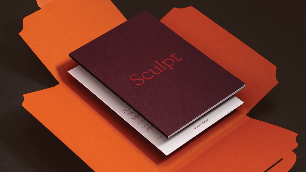
The brand leader package for Sculpt comprises a burst-bound brochure (opposite page), along with other materials, housed in a beautiful custom die-cut wallet produced using Ball and Doggett Colorplan Rust. The wallet has been embellished on the outside using a dense, matte brown pigment foil (see previous page). The orange stock creates a vivid colour far beyond what is achievable using standard CMYK print. The brochure cover continues this theme by using Colorplan Claret. This deep red works to create an overall analogous colour scheme.
STATIONERY:
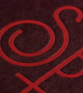
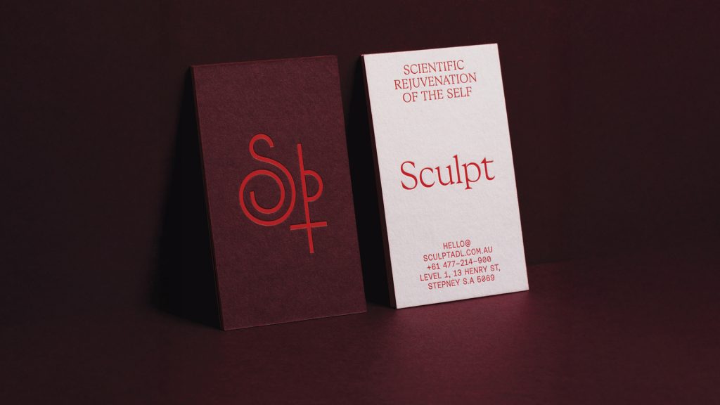 This business card shows the front and back of the same card, produced using two Colorplan stocks (Claret and Cool Grey) duplexed together and embellished with a matte red pigment foil. You can also clearly see the textural difference between the stock and foil.
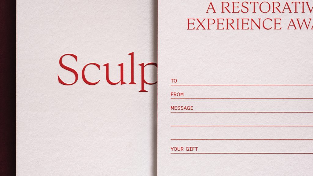 The comp slip and gift card were both produced using Colorplan Cool Grey and embellished with a matte red pigment foil—meaning no printed ink has been used.
We would like to thank the team at Studio OK-OK and Express Colour for sharing their beautiful project.
Colorplan stock is available in Australia via Ball and Doggett—go to: //ballanddoggett.com.au
For NZ readers, the equivalent coloured stocks from BJ Ball are Burano or Trophee—go to: //bjball.co.nz