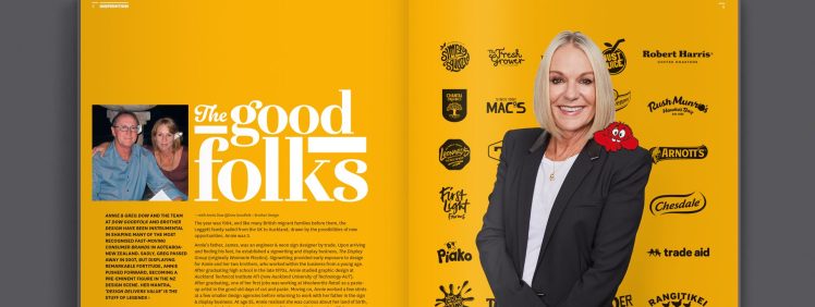
Annie and Greg Dow, and the team at Dow Goodfolk and Brother Design, have been instrumental in shaping many of the most recognised fast-moving comsumer brands in Aotearoa New Zealand. Sadly, Greg passed away in 2007. Displaying remarkable fortitude, Annie pushed forward, becoming a pre-eminent figure in the NZ design scene. Her mantra, ‘Design delivers value’ is the stuff of legends.
An early intro into the world of advertising
The year was 1964, and like many British migrant families before them, the Leggett family sailed from the UK to Auckland, drawn by the possibilities of new opportunities. Annie was three.
Annie’s father, James, was an engineer & neon sign designer by trade. Upon arriving and finding his feet, he established a signwriting and display business, The Display Group (originally Waimarie Plastics). Signwriting provided early exposure to design for Annie and her two brothers, who worked within the business from a young age.
After graduating high school in the late 1970s, Annie studied graphic design at Auckland Technical Institute ATI (now Auckland University of Technology AUT). After graduating, one of her first jobs was working at Woolworths Retail as a pasteup artist in the good old days of cut and paste. Moving on, Annie worked a few stints at a few smaller design agencies before returning to work with her father in the sign & display business.
The start of an international career
At age 25, Annie realised she was curious about her land of birth. So she embarked on a globetrotting expedition, or as Kiwis say—her OE (overseas experience). The first stop was Sydney, where she worked for firebrand Australian studio Billy Blue. From there, Annie moved on to London, where she began freelancing. This included time with industry leader Pentagram. Through this formative period, Annie fostered an interest in working within the three-dimensional space and developed a deep understanding of the power of packaging design. As Annie fondly recalls, ‘this love was fostered by her time working with her father & brothers within the display business creating concept renders for display stands. This was mainly for cosmetic brands such as Helena Rubenstein and Revlon. Packaging became a new passion. As Annie explains,
‘With packaging, I love that you have a small space in which to work, to convey the right messaging, like a mini poster’.
A fortuitous meeting
 Annie returned to New Zealand in 1991. Within a week of getting off the plane she fortuitously met her future husband, Greg Dow. Greg was a well-known advertising man and one of the creators of the famous Kiwi Lager brand look. Unbeknownst to Annie, her life was about to start a new and wonderful chapter. ’Greg and I worked very well together and soon brainstormed our commercial future. We both saw an opportunity within New Zealand—where, unlike the UK, there were very few creative studios specialising in packaging design for the FMCG sector (Fast Moving Consumer Goods). Identifying this gap—Dow Design was born’.
Dow Design – FMCG Packaging
Although bringing complementary skills to the venture, Annie and Greg were also highly competitive. This drive, coupled with an ability to build great relationships with clients, saw the studio gain a reputation for excellence. This attracted some of the biggest names in the local FMCG sector—including Heinz Watties, Tegel, NZ Dairy Foods (formerly Fonterra), Cerebos Greggs, Heller, Griffins and Dominion Breweries (DB) to name a few. Dow Design grew rapidly to the point that Annie moved off the tools to focus on building the business and developing client relationships.
‘The art of negotiation and selling was where I felt super comfortable. Possessing an eye for graphic design and an innate intuition meant I had found my sweet spot’.
Expansion and Beyond
In 2001, Dow Design opened a studio in Melbourne to better service Trans Tasman clients. Then in 2006, after winning a pitch for supermarket giant Foodstuffs’ house brand Pams, launched their sister company. Aptly named Brother Design, it was established specifically to work on this account.
‘The work for Foodstuffs, undeniably the largest food brand in New Zealand, is one of the most significant bodies of work we have managed and produced over the past 18 years’.
By 2007, Dow Design had attracted international attention. An American design business, that owned a portfolio of studios across the US, was looking to move into the Australasian market by acquiring an existing business in the region. Life, however, can be sharp and cruel. In the middle of the sale negotiations, tragically, Greg unexpectedly and suddenly passed away. Following Greg’s passing, Annie, seeking purpose and feeling the need for stability, walked away from the sale.
Dow Goodfolk
 In 2018 the Dow Group acquired the digital studio, Goodfolk, and Dow Goodfolk was formed. Today, Dow Goodfolk continues to set the bar for design in the consumer goods sector in New Zealand. A testament to both Annie and the many skilled staff that she has fostered over the years and their passion for the work.
‘We have always been very well known as leading in the packaging space’.
Reflecting on the journey, Annie shared the following thoughts, ‘There have been many business challenges and significant adversity, throughout which I have learnt to trust my gut and embrace change as it has been forced upon me. I’ve learnt to reset, restructure and reposition very quickly. Today, myself and the team are very nimble’.
The Black Pin
In 2019, in recognition of outstanding achievement and lasting contribution to the local design profession, the Designers Institute of New Zealand (DINZ) awarded Annie Dow a Black Pin. ‘Reputation is very important to me. Integrity is very important. Delivering design excellence is very important. Possessing an open mind and a sense of curiosity to make something better is very important. I am extremely proud of my contribution to the New Zealand design landscape. To this day, I still thoroughly enjoy what we create and am very proud of how we have built some of the strongest Kiwi brands and businesses.’
‘I firmly believe that packaging is one of the most powerful marketing tools, your silent salesman; when executed with craft, care & a strong understanding of what a brand stands for, brand & packaging design will always add genuine value. That’s the big buzz’.
COOKIETIME REFRESH
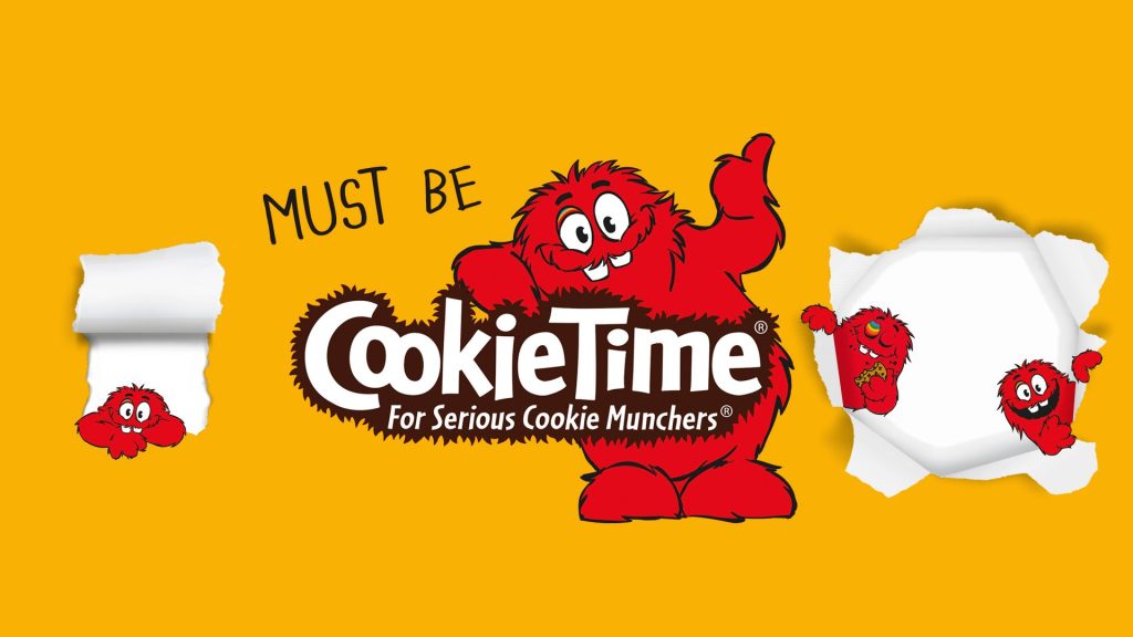 Christchurch-based biscuit brand Cookietime has been around since 1983. It is established nationwide as a cookie of choice for kiwis. In 2012, it was decided that the brand had become somewhat stale and needed a refresh. The team at Dow Goodfolk stepped up to the plate. They conducted ‘extensive product research’, before engaging world-renowned Italian illustrator Alessandra Sorrentino to update the Cookie Muncher character. The final step was to rework the packaging to create a more youthful, fun and product-orientated offer.
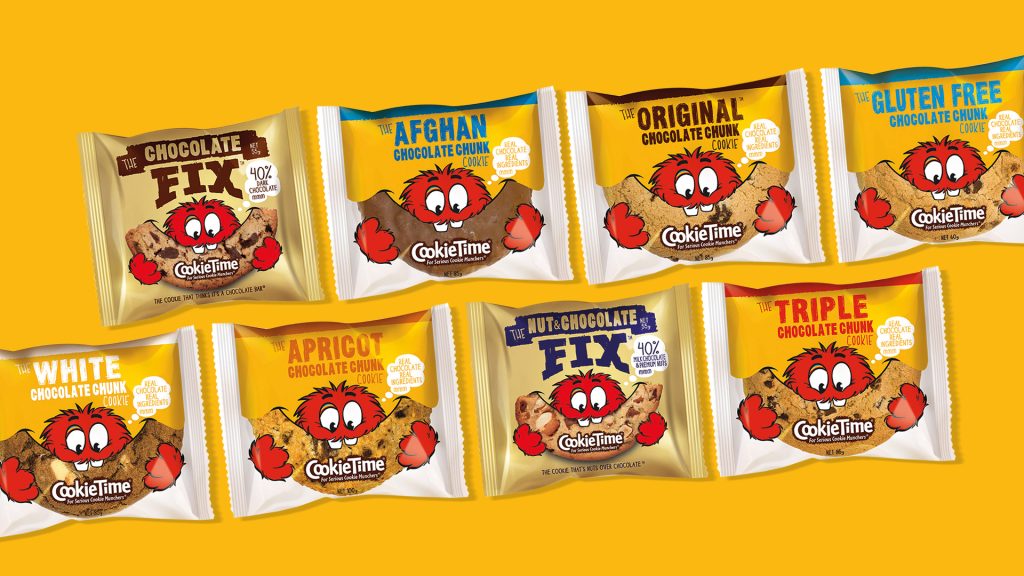
AS SURE AS HELLERS
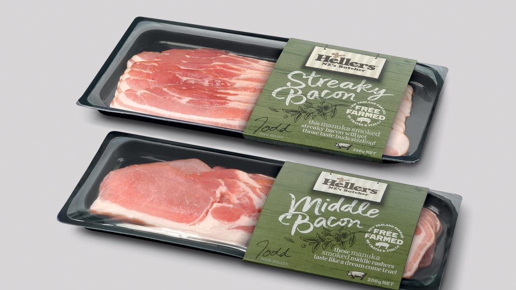 Meat producer Hellers began in the 1880s when Gord Heller emigrated from Germany to New Zealand. He set up shop in Arrowtown (near Queenstown), selling his smallgoods to gold miners during the big rush. Still in the family today, Hellers is a household name across New Zealand for their wide range of supermarket small-goods. Everything from bacon to salamis to sausages.
Over the past 20+ years, Dow Goodfolk have produced many different solutions for the brand including the above packaging.
PAMS
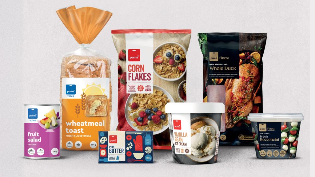 Owned by New Zealand grocery giant Foodstuffs, the Pams brand dates back to the 1930s. It was launched as a ‘house’ range to provide consumers with a lower-cost alternative for their supermarket trolley. Fast-forward, Pams is today a household name to the point it is the largest grocery product brand in New Zealand. An achievement far beyond its humble beginnings. Demand has grown, and a greater variety of products, including more premium offerings, have been added to the range. This prompted a re-think in approach. Brother Design was assigned this task in 2019 and subsequently developed an entire product-positioning system. Based upon three tiers: good, better, best. The three-tier system was reflected in the packaging through the use of photography, shape and colour:
- Photography tells the story, inspiring consumers about how to use the product
- A white tab device adds consistency, creating a strong shape containing the key communication
- Colour complementary to the product enhances the offer
The resulting system creates a distinct look for Pams, calling the products off the supermarket shelf. The work was internationally recognised for excellence in 2020 at the Vertex Awards.
30 YEARS OF BUILDING BRANDS
 The team at Dow Group, encompassing Dow Goodfolk and Brother Design, has developed numerous brands over the years. From small boutique identities to some of the largest consumer ‘household name’ brands in Aotearoa–New Zealand.