Recently, Karu Distillery undertook a significant brand refresh for its Outcask Wild Rum. Originally, it had been released in a bit of a rush, and wasn’t feeling ‘quite us’. GSM takes a look…
Karu Distillery, launched in 2018 by husband-and-wife team Nick and Ally, is an up-and-coming Australian brand known for its innovative spirits that blend traditional distilling with a modern sensibility. Located in the Devils Wilderness, NSW, the range has grown to include Affinity Gin, Lightning Navy Strength Gin, Morita Chipotle Vodka, and Outcask Wild Rum. As one of Australia’s most awarded distilleries, Karu is celebrated for its passion for quality and its commitment to the artistry and science behind each spirit
To elevate the identity and market presence for Outcask Wild Rum, Nick and Ally enlisted Heng Design, a design studio recommended by friends in the distilling community. Ally explains, ‘We were big fans of the labels Heng had created for other distilleries. When we met Nick at Heng Design, we instantly clicked. He understood the concept we were aiming for, and we knew he would nail it.’
Nick at Heng Design was honoured to be entrusted with a pivotal brand and packaging evolution. The intention was to create a bold statement that would compel consumers to pause, pick up and purchase. After meeting with the founders and researching the competitive landscape, a series of conceptual designs were refined to create the final label. The design process focused on emphasizing the raw, natural qualities of the product. With this in mind it was essential to select a label material that reflected those values.
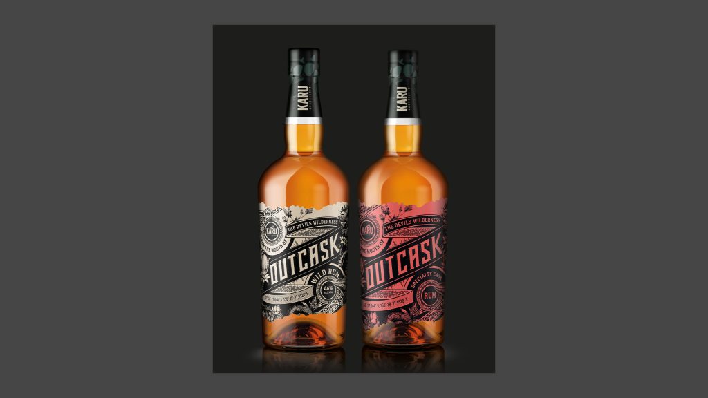
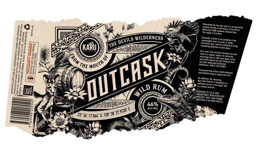
The Outcask Label
The label was printed on Wausau Aged Agave. This is a sustainable stock made from reclaimed coffee bean sacks and part of the Ball & Doggett Wausau ‘Inspired’ range. Ally highlights the importance of sustainability for Karu Distillery, ‘As a small business, we understand that sustainability is a journey. It’s not always affordable to make all the changes at once. But little by little, we are committed to moving in the right direction’. Aesthetics aside, a key consideration in choosing this stock, was the FSC-accreditation and being made from 100% post-consumer waste.
The Collaboration
Australian printer, Peacock Bros., has been a trusted partner for Karu for many years. Once again they went into bat on the Outcask labels. The collaboration between Heng Design, Peacock Bros., and Karu Distillery was integral from the outset. This ensured that the design and printing processes aligned with the vision. Nick from Heng Design notes, ‘It’s so important for the creative team and the printer to collaborate early in the process to ensure that the design, chosen stock and embellishments are achievable. And if not, to devise a solution that is viable’. Importantly, all parties involved are Australian-based. This meant quality control was on point and the ability to discuss the project was seamless. Using a local supplier also enabled the team at Karu Distillery to visit the printery and see the process— a valuable experience.
The Printing
The labels were printed using an HP Indigo Digital press. Then finished using an ABG S3 Digicon press which applied a high-build varnish. This was used to add texture and emphasis to certain areas of the design. Foiling had initially been considered, but was ultimately shelved to maintain the ‘raw’ feel of the label. Thus staying true to the original design brief.
The Feeling
The rebranded Outcask Wild Rum has proven to be a success. As Nick comments, ‘The client is thrilled with the new look, as is their community of consumers. It has gained so much great feedback from the public already. This is a perfect example of when the creative and the printer work in sync with one another to achieve optimal results.’
For Nick and Ally of Karu Distillery, the new label for Outcask Wild Rum captures the essence of where the spirit is made and what it represents. As Ally explains, ’The label now truly feels like it belongs to us.’ The rebrand has not only improved the visual appeal of the product but has also reinforced Karu Distillery’s commitment to quality, sustainability, and creativity in everything they do.
GSM would like to thank Nick Heng @Heng Design, Nick and Ally @Karu Distillery for their assistance in writing this article.
For more information on Wausau Aged Agave stock—go to:
- Australian readers: //ballanddoggett.com.au
- NZ readers: //bjball.co.nz