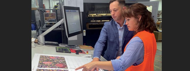
Leonardo Cockburn

The Message Stick – Respectfully incorporating First Nations art & culture.

first nations

In this issue of The Message Stick, Rebecca Wessels further enlightens us on how best to incorporate First Nations art and culture into commercial work in a sympathetic and respectful manner. For tens of thousands of years, First Nations peoples commonly used message sticks as a way of communicating between different groups in Australia. For GSM, the concept of The Message Stick is that the stick will be passed from speaker to speaker to continue our discussion about First Nations culture and traditional knowledge. Our intention is for these discussions to provide some guidance and understanding of how we can...

Continue Reading →

Rākau Kōrero – Kaitiaki

Ōtautahi Christchurch artist and designer Morgan Mathews-Hale (Ngāi Tahu, Ngāti Porou, Tainui) @ Kaitiaki Studios (Ōtautahi-Christchurch) shares her views on bicultural collaboration and working together. Ko Morgan Hale tōku ingoa. He uri tēnei nō Ngāi Tahu, nō Ngāti Porou, nō Tainui hoki. As an artist and designer, I find true joy in visual expression and storytelling, and in seeing the impact my work has on the people who interact with it. Kaitiaki Kaitiaki is the Māori concept of guardianship, representing care and consideration and adapting ourselves internally as we exist in harmony with our natural world, with others in our...

Continue Reading →

Tipping Point Wines – Sustainable Packaging

tipping point wines

Tipping Point wines gift packaging recently won Gold at the New Zealand Pride in Print awards, GSM takes a look... The Background on Tipping Point Wines Al Brown is recognised around the world as a leading New Zealand Chef and Restaurateur. He is also quite the entrepreneur who values aligning himself with people, organisations and brands he feels a strong connection with. Partnering with Constellation Brands, Al launched Tipping Point Wines. Wine which aims to do good and taste great, with each varietal supporting five not-for-profit organisations that are working hard to create a better future for New Zealand: The...

Continue Reading →

Mark Cleverley – Craft Master

Mark Cleverley

If you lived in New Zealand in the late 1960s—70s, chances are you have seen the work of Mark Cleverley in the form of tableware by Crown Lynn. But as we have discovered, Mark was not only a creator of ceramics - but a true multidisciplinary in every sense of the word "Design". Mark Cleverley became one of Aotearoa New Zealand’s leading creative influencers through a six-decade outpouring of ideas and creations—spanning ceramics, architecture, graphics, type design, textiles… the list goes on. In 2014, in recognition of his significant contribution to the profession, The Designers Institute of New Zealand bestowed...

Continue Reading →

Pantone Swatchbooks

pantone swatchbooks

Supporting the Pantone Matching System is a range of swatchbooks. Understanding the different versions and their intended uses ensure you will use the right tool for the job. GSM takes a look: Formula Guide: Two x books (C & U): Formula Guide swatchbooks show the base range of 2,400 PMS colours, along with the corresponding ink formula. Printers use these formulas to mix Pantone colours. Bridge Guide: Two x books (C & U): The Bridge Guide swatchbooks show the same base range of colours as the Formula Guide—but instead of showing the ink formula, the Bridge Guides show each Pantone...

Continue Reading →

Colour Gamut: Screen vs Print

colour gamut

When it comes to colour, a common frustration is the mismatch between what you see on-screen versus the printed result. Understanding why this is the case, can help you to navigate this issue. GSM compares the RGB colour gamut vs CMYK... RGB Colour Gamut To create colour, a device screen uses varying degrees of light, specifically Red, Green, and Blue light (otherwise known as the RGB Colour Mode). More than 16 million colours are possible using RGB—significantly more than what the human eye can distinguish (about a million). RGB vs CMYK Colour Gamut Compare this to the CMYK colour mode...

Continue Reading →

Pantone Colour – expanding the printable colour range

pantone swatchbooks

For this installment of Education, we return to Pantone colour and how this can expand the printable colour range. We all know that colour is a powerful tool for a designer. But how can you get more from colour when designing towards a print outcome? The answer may be through the use of Pantone colour. But first, let’s take a quick look at the theory of printed colour, and why CMYK and Pantone colour differs.  CMYK Colour 99% of all printed material uses a CMYK-based colour model. CMYK is based on the principle that printing varying amounts of Cyan, Magenta...

Continue Reading →

Formakote Packaging Boards-Whakatane,NZ

whakatane formakote

Form and applied graphics aside, successful fibre-based packaging solutions require using the right stock to match the product and the demands of the retail environment. As this is such a critical consideration, we asked Brett Keen from New Zealand's Whakatane Mill to shine some light on their Formakote range of specialist packaging boards. Packaging Small-Medium Sized Goods Small-medium goods is a general term meaning; retail products that a consumer buys over a counter, off a shelf, from a website, or out of a chiller. Of course, this encompasses a wide range of products, including dry, fried or frozen foods, beverage...

Continue Reading →

Paper Packaging – Naturally

In the battle against single-use plastics in packaging, board and paper play vital roles as renewable and highly recyclable alternatives. GSM talks with Kellie Northwood, from Two Sides, about decisions made around the design, production and disposal of packaging. A natural, renewable & highly recyclable material The environmental impact of discarded, man-made materials has reached critical levels. Many of these materials can last in the environment for hundreds, up to thousands of years. The existence of this waste can harm Earth’s flora and fauna. There is a greater need, now more than ever, for packaging to be sustainable throughout the...

Continue Reading →

Stappa Wines – Plain Black & White

stappa black & white

When it comes to consumer brands - Alcohol is one of the more congested. With so many choices, it can be challenging for a new brand to stand out. But one recently launched brand caught our attention here at GSM. Not because it was loud or brash - but quite the opposite. Sometimes things are best left in plain black & white. If we go back to the 1990s and earlier—it was reasonably common to see designers working in one or two colours on print projects. This decision was usually driven by cost—black & white printing was cheaper than full-process...

Continue Reading →