GSM takes a look at alcohol & beverage labelling and how, through the right combination of graphic design, print production and choice of stock, a label can transform a product into “Bottle Art”.
The world of Alcohol & Beverage is a highly competitive market. Nowhere is this more evident than in the battle for our attention off-the-shelf. Creating cut through, in particular with labelling, in the busy environment of the retail shelf is very much the holy grail for designers who work in this space.
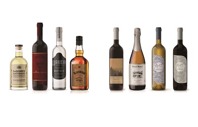
Multi-Color Corporation (MCC Labels) is a global supplier of premium label solutions, working alongside designers in pursuit of achieving such wondrous feats. John Madden, Production Manager at MCC Labels (NZ), shares with us two labelling projects which stand out. Created twenty years apart, the common denominator between them is the synergy between design, print production and stock.
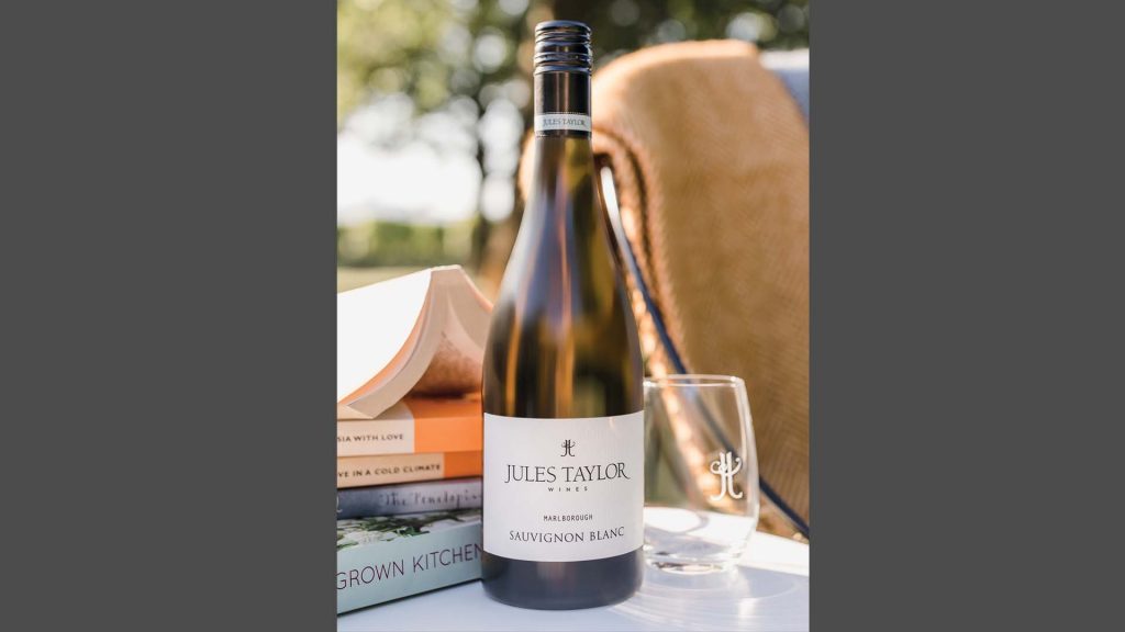
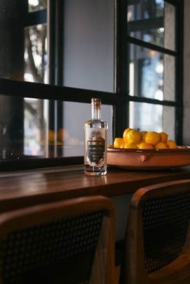
Jules Taylor Wines Brand & Labelling
 Jules Taylor sees her love of wine as a simple pleasure to be enjoyed alongside good food and great friends. She firmly believes that wine should be more about creating great memories—and less about status or cellaring potential. For these reasons, Jules left her corporate winemaking career, twenty years ago, to give her the freedom to make wines the way she thinks they should be made.
Labelling Design
 Sonya McKeefry, from Fresh Designs (Hawkes Bay), created both the brand expression and label design for Jules. Sonya explains, ‘Classic, unpretentious designs appealed to Jules. She wanted a brand and a label that would be timeless and work anywhere in the world.’
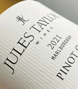
Sonya created the motif from the capital ‘J’ and ‘T’ letterforms. The strong vertical lines pay homage to the posts that hold up the plants and the soft ‘W’, the tendrils of the vines they support. As Sonya explains, ‘The label design combines traditional engraved serif fonts with modern sans-serif fonts. The elegant, clean confidence of the label design helps tell the story of a passionate winemaker who knows her craft.’
Print Production
MCC Labels handles production using either digital or offset print, combined with embossing for key elements such as the logo and grape variety. They then finish the label with two matt varnishes for scuff protection.
Labelling Stock
They chose the stock, BJ Ball Aqua Ivory, for both its soft whiteness and grain emboss to add tactile interest. Both allow the brand and the wine to take centre stage. From a practical perspective, it offers excellent moisture resistance. which is an important consideration for a chilled product.
This label does its job on the shelf and looks great when the wine is served!
Timelessness
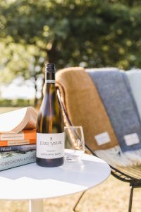 Fast forward twenty years and Jules has gone on to produce many wines of award winning character that are enjoyed all over the world. The brand is continuing to grow its reach globally whilst still using the same understated label design. Phoebe Rudge, account manager for MCC Labels, describes it as ‘a stunning result— new and existing customers frequently pick it as one of their favourites.’ And, from the designer’s perspective, Sonya says, ‘…I am honoured to have played a small part in the development of the Jules Taylor journey.’
Burnt Hill Vodka Labelling
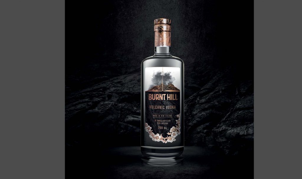 When you’ve gone to the trouble of distilling a Spirit eight times and then passing it through a unique lava rock filter to ensure purity and smoothness—you’ve got a genuine story to tell. Add to this a market of discerning mixologists and consumers—read: the devil is in the detail—your labelling needs to step up to the mark. This all contributed to the co-founders of Burnt Hill Limited, Ben Paul and Nathan Johnston, thinking it was time for a new label design.
Labelling Design
Cue, Joseph Senior from Offworld Design (Auckland). As Joseph explains, ‘This gave me a great opportunity to suggest a new look that, while remaining true to the original, had more visual impact and character. Something that would be bold and intriguing…’.
The final design was very much the result of a collaborative process between the trio and evolved the original label into a sleeker, more modern iteration.
Labelling Stock
As part of the design process, all parties agreed that the choice in labelling stock was very important. It needed to reflect the product’s positioning at the premium end of the Vodka market. However, because of their size, they also had to consider cost. BJ Ball’s new Wausau Bright White Felt ticked all the boxes. It provided the desired texture and thickness—at the right price point.
In addition, the stock contains 30% post-consumer waste. This fits well with Burnt Hill who go to great lengths to use only sustainable materials for their packaging (they even plant a tree for every bottle produced).
Print Production
MCC produced the label digital CMYK on an HP Indigo press, followed by a rose-gold hot foil and a gloss hi-build. They then added two matt varnishes for scuff resistance.
Pre-production meetings between the MCC Labels team, Joseph, Ben and Nathan— ironed out a number of potential technical issues and ensured everybody was on the same page. Of particular concern was the potential for in-fill of some of the fine detail in the rose gold foil. To solve this, they changed some of the fine elements, originally earmarked for foiling, to a printed colour.
John Madden at MCC Labels sums up the final result, ‘The natural texture and tint of the BJ Ball Wausau stock worked well with the design. It printed really well. In particular, the tonal range in the volcanic rock which came up beautifully. How well the foil took across the entire label also impressed us.’
Spectacular Results
 From the client’s perspective, Ben adds, ‘It was essential that our label represented us. Joseph, collabing with the MCC team, pushed the boundaries in this medium to take our concept to the next level. The results are spectacular’. From the design side, Joseph adds, ‘The client was delighted with the result, as am I. The design and print process came together to produce an eye-catching label with both character and modern appeal’
WHEN YOU’RE ON A ROLL…
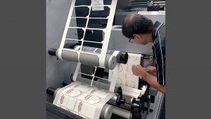
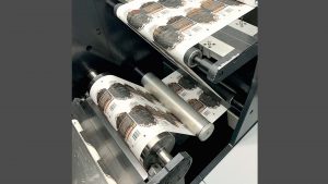 MCC Labels printed the Burnt Hill labels on a continuous roll of adhesive substrate, as opposed to sheets. In the world of labelling—the term ‘roll solutions’—refers to adhesive stock substrates supplied to the printer in this manner.
Mass-produced beverage products use roll solution substrates extensively. Machines feed off a continuous roll in order to apply the labels to bottles. Many of these substrates are moisture resistant to ensure the label survives chilled storage.
BJ Ball Packaging is one of New Zealand’s leading specialist suppliers of roll solution products. For more information on the available substrates go to: //bjballpackaging.co.nz
GSM would like to thank MCC Labels, Burnt Hill Vodka and Jules Taylor Wines for assisting in the writing of this article.
This article was originally published in GSM17. To read this and other great articles purchase this issue here.